
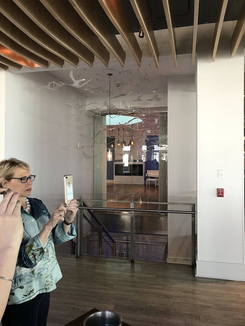
As I mentioned at the end of the last blog post I was fortunate enough to take Maria Killam’s Color Workshop at the Allegria Hotel in Long Beach, NY this past April.
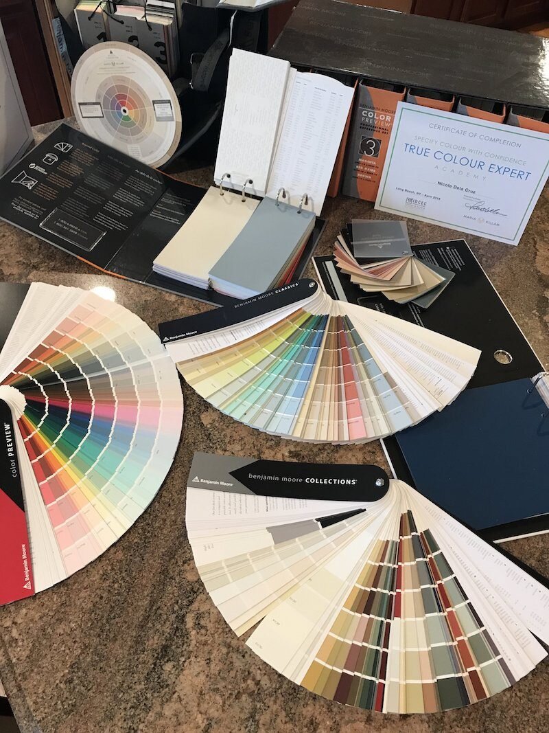
Maria is a True Color Expert and Blogger of Color Me Happy. The course was originally supposed to be in NYC but due to cost and the need for a venue with proper lighting, it switched to Long Beach which is literally twenty minutes from my house! I took that as a sign when I registered. The course was one of the best investments I have made for my business. The three days were spent with Maria teaching her technique which she has developed over many years. I should point out that I read Maria’s eBooks prior to the course but had not been a follower of the blog. I did find that those who had been reading her blog were more familiar with the information she was teaching since some of it was referenced in the blog posts.
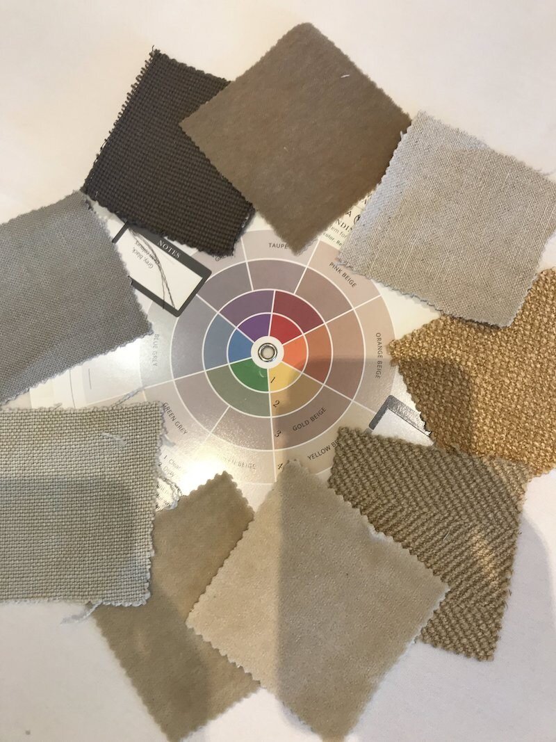
Maria’s technique is based on nine undertones. Coming from a background in designing Children’s clothes I found myself seeing some of the undertones differently and had to really train my eye during the course.
Here are some of my many takeaways from the three days:
Maria spoke about the difference of clean and dirty colors and how they should NOT be mixed together. If you do you will not have a pleasing room and something will look off.
She went over the timeline of the various trends and explained that the typical life span of a trend is 10 years.
2000’s Tuscan Trend (my current house situation)
2010’s Charcoal Gray trend
2020’s Black is the new gray! Black & White are trending. The popular wall color is art gallery white. Pops of color mixed with a neutral color palette is popular. Greige which is charcoal with beige is also trending.
The importance of having a style and point of view was discussed and how it will set you apart from other designers. Kelly Wearstler, Tobi Fairley, and Caitlin Wilson are examples of this.
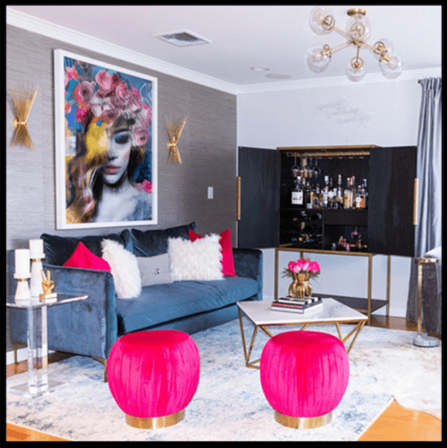
Maria stressed the fact that despite what most people think choosing the paint color is NOT the first element of a room design. In order to achieve a “look and feel” for your space you must first choose an item to pull from. Examples of this are a piece of artwork, rug, duvet cover or anything else which a color palette can be pulled from. One of the best places to start to build a color scheme from is the pillows since the art and rug take longer to figure out.
The other key factor she discussed before designing a space, especially in an open floor plan, is to determine the hard finishes of you space. In a kitchen for example your countertop, backsplash and cabinets are examples of these. In the Living Room your fireplace stone or carpet is a fixed element. These are things that are more permanent unless you plan on changing them which will be costly. Your design and color choices should be based off these items to create a beautiful space. If you have a kitchen in the tuscan trend you cannot just change your walls to gray! You must first understand the undertones in your space and then work your design from there. Another example is if you have an earthy Tuscan trend kitchen you are not going to be able to paint your trim in a bright white. An ivory or cream white would be the better choice since it will create a softer look that is more pleasing to the eye. When creating flow in an open floor plan Maria starts with the living room and works out from there.
Another lesson during the course was of the Benjamin Moore color wands. Maria explained that the BM Color Preview wand is brighter than the Classic and Historical and is typically used for kid’s rooms or commercial spaces. The classic wand has been reduced down and many of the unused colors have been removed.
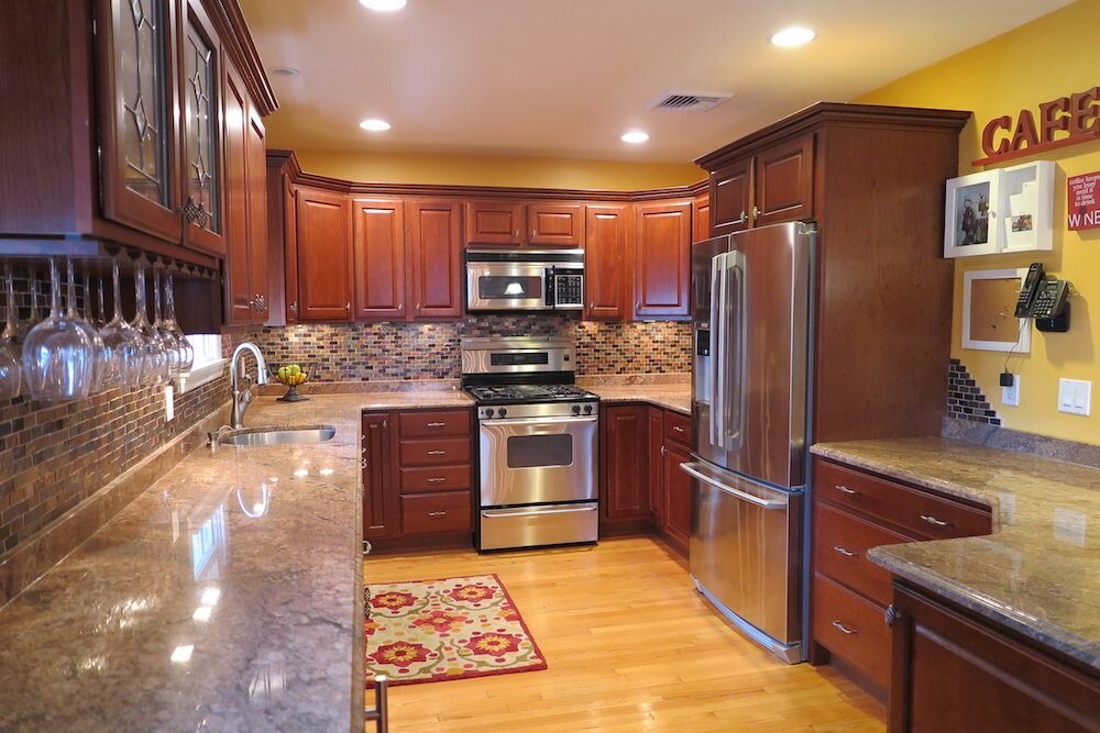
Maria stressed the fact that everyone wants what everyone else has! In order to create a timeless space, one should not go too trendy. If your larger pieces are neutrals then you can update with accent colors in your pillows, artwork, accessories or rug. In kitchen design Maria usually specifies subway tile because it is classic and timeless. She pointed out that most people choose a bossy counter top and a bossy backsplash which is a bad idea because you the have to work with those elements and they also take away from having a star of the show. Many homeowners make the mistake of trying to put every single trend in their remodels instead of focusing on one area to be the “star”. For example, if you have a bossy granite counter top it is best to select plain subway tile to not have your eyes all over the place when looking at the space. The other option would be to have a dramatic backsplash with a simple white quartz countertop. I made this mistake in my own kitchen as seen in this photo.
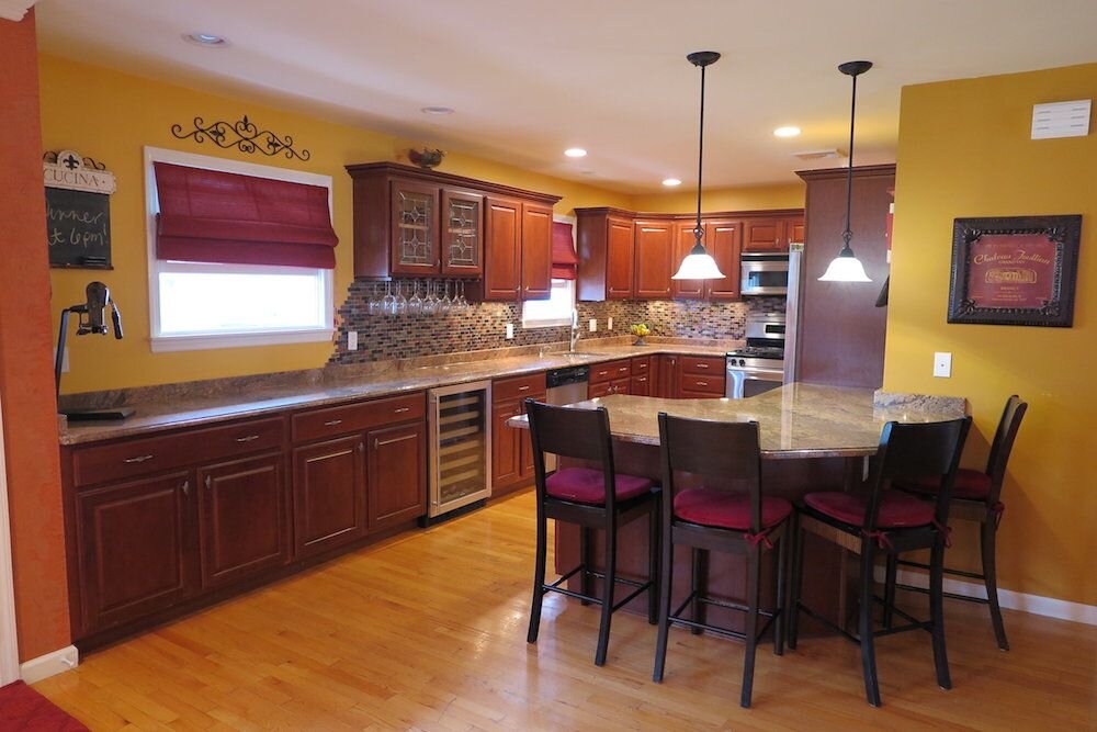
I have a pink beige granite counter top with a very bossy backsplash. During the breaks between lessons Maria was always available for individual questions. On the second day I showed Maria my kitchen and asked for her suggestion on painting my cherry cabinets white. She said a firm NO! She said the cabinets are not the problem it’s your bossy counter top and back splash. Her suggestions were white quartz counters and white subway tiles. She said just leave the cabinets and the change she suggested would make a huge difference. Since it always takes me a minute to accept something I don’t want to hear I tried to get Maria to give me another suggestion with the option of painting the cabinets white. No Shot! Maria wasn’t budging with her advice lol. When I finally accepted that Maria was telling me the honest truth and best option I took her advice and called my husband. Since we plan on downsizing eventually anyway he was on board with a kitchen face lift in the near future. One of the qualities I must say I love about him. He is always on board with change! So, the future update plan will include painting the cabinets, changing the counters, backsplash, knobs, lighting and stove (since it is dying anyway). On a side note if I wanted to get rid of the yellow walls today I could go with Classic Gray OC-23 (greige) since there are flecks of grey and black in my granite. I actually brought a sample of my granite into class and Maria did a mini lesson with the class since I was obsessed as usual.
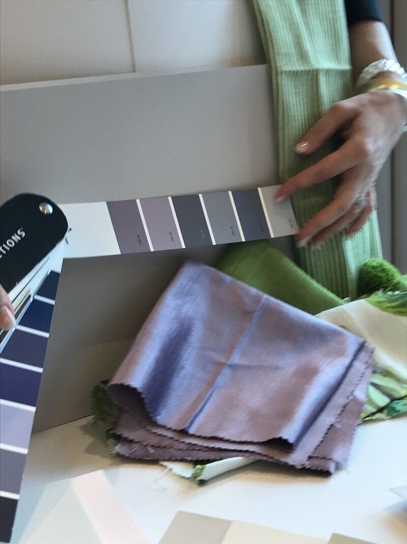
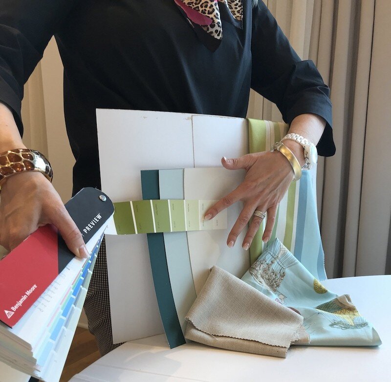
During the three-day course there were many exercises and lessons working with Maria’s large paint boards (which I own), fabrics and hard finishes. She went over her process for choosing color palette and creating flow in a space. The class would then break out into smaller groups by table and would work on the exercises. Maria would review each of the choices with the class and then approve or suggest a better option. Some of the valuable information she also shared was that your wood floors are like a pair of jeans and will go with any color palette. A medium brown wood floor is timeless and classic. To be careful going too trendy. For example, if you put in a gray wood floor right now you’ll be decorating with gray forever and this trend is on its way out!
As a rule, the color Muslin or pale oak goes with pink beige. The transition neutral that works with dated finishes and updates yellow is Manchester Tan. It is also the answer to the Tuscan Trend.
A tip she gave for anyone trying to pull off the art gallery white wall trend is to remember you need to repeat the white in your furniture, pillows ect.
Neutral Rule #1: Limit the amount of neutrals in a room to one or two the most.
Color Rule #2: Limit the number of colors you use to three plus neutrals.
Always remember you cannot pick a paint color for a room when it relates to nothing. You need the bedding, artwork, a rug or something to base the “look and feel” of the room off.
You must always compare when choosing a color. Contrast and compare! Put white behind your color boards when choosing a color or determining the undertone.
Lay your boards and finishes out in the direction they would go in the room.
The control color is always the one that is controlling the room, the bossy one.
You can mix undertones as long as they go together.
When remodeling pick you wood floor first then your counter top finish.
Subway tile is available in white, off white and crème.
For a classic kitchen that won’t go out of style go with white cabinets, counter top and subway tile backsplash. The backsplash pattern can be horizontal, a chevron pattern, basket weave ect. Then update the color of your accessories.
Table scapes and vignettes are essential to good design. Style your space to the max.
Choose the correct white!
Use feather down inserts (not for the vegan design client however)
Study the current lighting trends.
Always take photos in natural light (turn off all lights) and square off the room. Line up the edge on your iPhone with a line in the room you are taking a photo of.
Shop online to get the best possible result.
Use blackout lining so drapes don’t change color
You must choose everything at the same time for a room.
Know your aesthetic!
Always have the homeowners leave during install.
When clients share a Pinterest image for inspiration make sure to ask what they like about the images.
It’s ok to fire a client if they don’t trust you (great tip)!
You must be able to tell your client NO when something won’t work (as Maria clearly did with my kitchen dilemma lol).

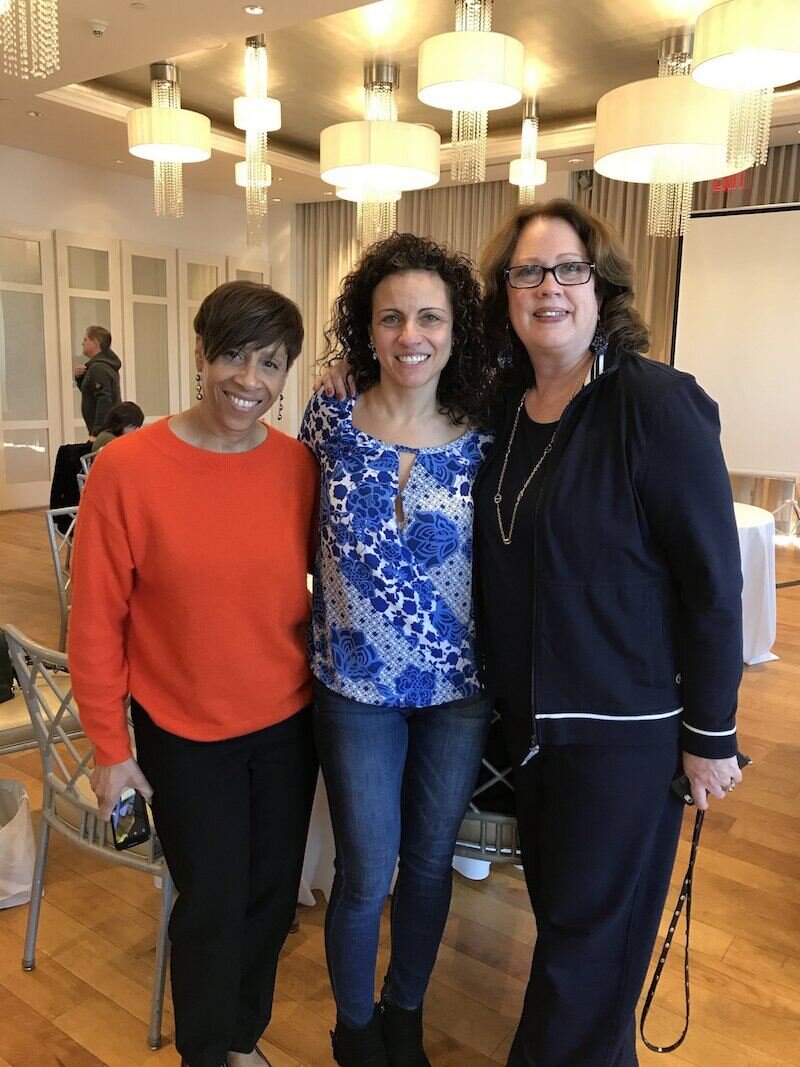
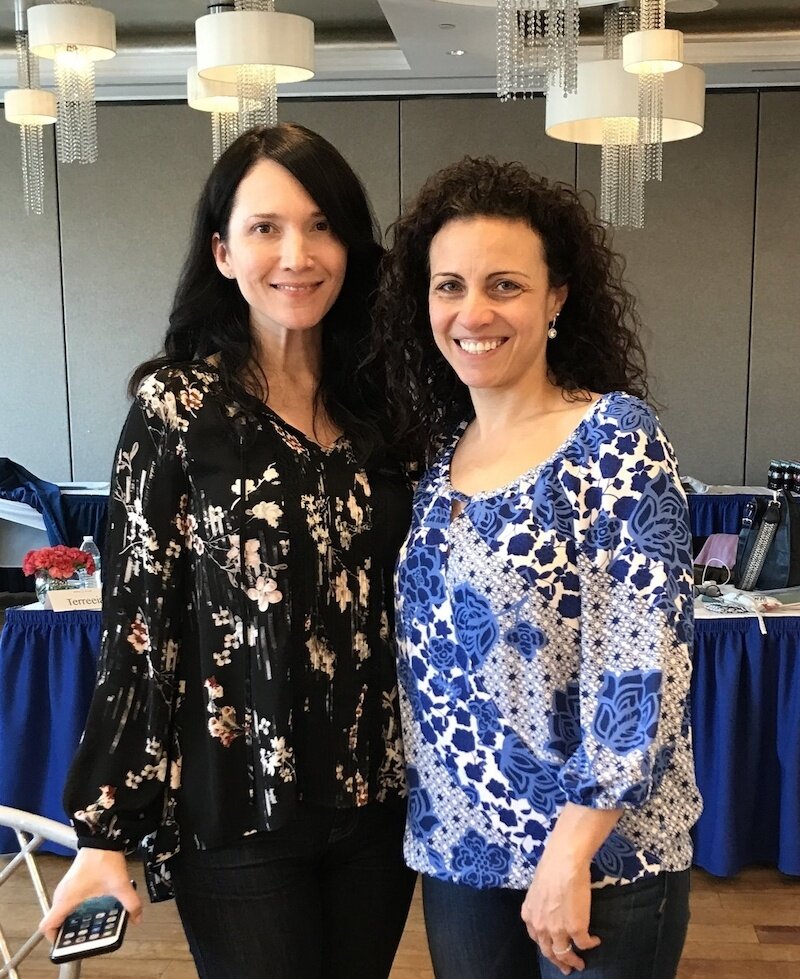
Aside from the education and learning I attained from the course I must also mention the networking with fellow designers and classmates which was invaluable. I had the privilege of spending the three days with awesome designers such as Claire Jefford, Wendy Woloshchuk and Jennifer Tampasis to name a few!

It was awesome to be surrounded by such amazing talent and I felt like I was in a design bubble the entire workshop! I absolutely had a great time with lots of laughs! At lunch and dinner (on the second day) I continued to learn as so many of the designers shared their experiences and knowledge. On Wednesday night after dinner I was even a part of Claire’s WIDWIL!! That was so much fun!

Wendy told me to get on Facebook Live and do a video for visibility. Wendy is on everyday and apparently, it’s a thing for Interior Design. Since I just do whatever my role model peers say to do, I did it! The first one was pretty bad but they can only get better and I have pretty much convinced myself no one is watching. Since then I have done a FB Live video every Friday consistently to document my journey and share what I’m learning along the way! Thank you Wendy!!

Another former Children’s Wear designer I met was Elizabeth Delaney Burke who works at the Duralee showroom in Syosset, NY. I had never been before but the Friday following the course, I went, Elizabeth gave me a tour and I’ve since opened my account. Elizabeth was extremely helpful in explaining the process which made me more comfortable and would not have happened if not for meeting at the course.
I have continued to keep in touch with many of my fellow classmates and can’t wait to meet up with them at future events! Needless to say, for anyone on the fence about whether the class is worth it clearly, I strongly believe it was and highly recommend it!!
For anyone that made it this far thanks for reading : )))
xo Nicole
PS I just learned that blogging can be a lot less text and with more pictures! Ugg I’ll be trying that method next since to date I’ve been writing college essays lol!!

For more shoppable designs check these out from my Like To Know It page.
Note: My blog periodically contains affiliate links meaning that if you make a purchase, I might make a small commission at no extra charge to you. Purchases made through them are greatly appreciated.


Hi! This is such a helpful post. I’m going back and forth about attending Maria’s Palm Springs workshop in Feb. I’m just a home-owner, trying to figure out how to stage my home for sale, and how to decorate my new home. I am a diy person at heart, and always prefer to learn something myself rather than pay someone to help me. But it’s such a huge investment, and I have absolutely no experience in interior design, so it’s a little intimidating. Do you think I should go?? Thanks!
Hi Kristin! It was such an amazing experience for me and I think you’d LOVE it. Maria teaches you how to make your home timeless and creative a “look and feel”. It would be super helpful if you are trying to stage for resale and in your new home when decorating. If you are able to invest in the course it would be invaluable in both of these areas. Plus you will have so much fun and feel like you are in a design bubble the three days you are in the class. Good luck and let me know what you decide. If you do go I’d love to hear what you thought as well! xo Nicole