One of my favorite things to do when designing is to use a rug as a jumping-off point.
I had some downtime yesterday so I decided to play with some color palette options.
Many people struggle to see past the sofa fabric they are looking at when designing their space and don’t know how to choose fabrics to compliment it.
In this post, I’ll share part of my process of creating a “look and feel”.
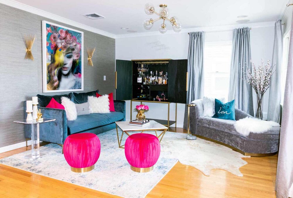
I posted this picture to show you how you can use a rug to start planning the color palette of your room and then by adding in a pop color such as the fuschia shown here you can add interest.
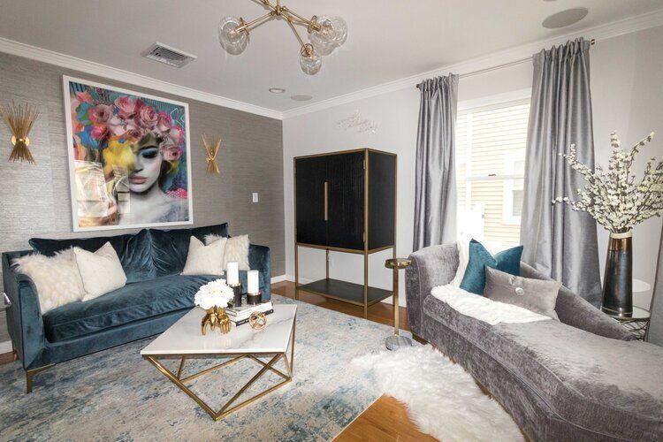
This is the same room without the pop of color.
As you can see the pink really brings the room to life and adds interest. It also carries your eye throughout the space by repeating the color throughout.
This follows one of the most important design rules of Interior Design which is Repetition.
Repetition is the use of the same element more than once throughout a space.
You can repeat a pattern, color, texture, line, or any other element, or even more than one element. Repeating a continuous pattern throughout the space will create a sense of stability.
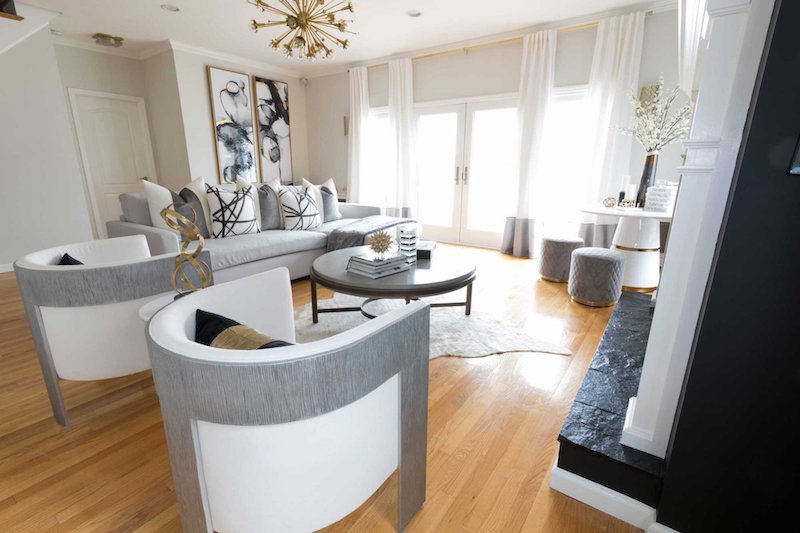
In the above room, another design principle contrast is illustrated.
The hallmark of this design principle is when two elements in opposition to one another, such as black and white pillows on a sofa, are used.
Contrast can be quite jarring and is generally used to enliven a space.
This space would have a completely different feeling without the use of black to contrast all the grey and white.
Now that we have those two principles established I’ll show you some of the concepts I was playing with today.
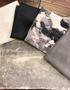
This is one of my favorite rugs!
It’s a viscose blend and has a subtle sheen to it similar to the turquoise rug from the first picture I shared above.
There are three shades of grey and a creamy white in the contemporary abstract pattern.
I paired this rug with the creamy white Crypton high-performance fabric, black shimmer linen, a sublimated print chenille, and a yummy heathered velvet.
Here the sofa could be in the cream, chairs in the grey, pillows and maybe an ottoman in the print and black fabric.
You can see how you can start to visualize a room starting to come to life.
Cool Right?!
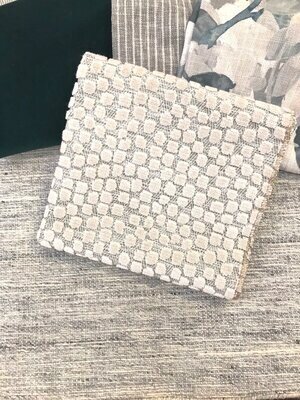
Here is another color story where we paired a simpled grey wool textured rug with a very zen vibe with green velvet, a grey stripe, printed linen, and a novelty embossed textured fabric.
The play on textures and pop of green creates interest to an otherwise very neutral color palette.
The print ties all the colors together and adds a bit of a feminine touch.
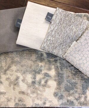
Here is another viscose patterned rug that has blue along with the neutral creme and grey.
This one was paired with a grey velvet (sofa) yes I am a lover of velvet these days!
We also added the Crypton chenille fabric and a linen print along with that novelty embossed fabric which clearly is one of my favs!
This room could have blue drapery panels for added interest or if you wanted it more neutral you could pair it with creme and a grey border panel.
Can you see how a room of your own style can be created just by playing with fabrics, colors, and textures?
I love this part of the job!!
Side note: I recently read in the book I Am Enough: Mark Your Mirror And Change Your Life by Marisa Peer. In the book, she said that you should go back to the age of 7 through 14 and really analyze what it was that you LOVED doing during that time. Most likely that is related to the path/ career you should also be on in your adult life as well. For me, that was the time when I was sewing, designing clothes, in fashion shows and creating. Hense my twenty-three-year career in fashion as a Children’s Wear designer and current new path in the world of Interior Design!
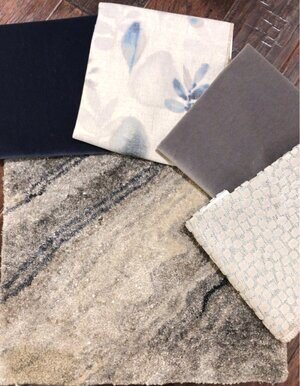
This beautiful rug has a line of navy blue through the neutral abstract pattern so we paired it with navy velvet, a gorgeous print that has creme, greys and blues, grey velvet and that novelty fabric I love again.
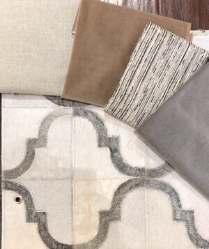
Now, this cowhide rug is not vegan-friendly but it is a thing of beauty!
There are touches of cream, grey, and tan.
This was paired with a more yellow-beige which is a revolution high-performance fabric and the velvet in tan and grey.
We also added the stripe which has all the colors and a touch of black which can also be introduced to the design.
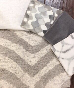
The last one in this series is a grey and creme zebra patterned rug.
This was paired with the creme Crypton fabric, two abstract patterns, and the grey velvet.
The patterns all work together even though there are three because they are all of the same color stories and have similar movements.
There is also a variety of scales to the patterns as well.
As a designer, one of the best parts of the job is the ability to create newness and one’s own take on what is currently trending.
By keeping the main pieces of the room neutral you also have the ability to change up the look of your space as it evolves.
Maybe you want to add a pop of pink to an otherwise neutral palette or what about a touch of yellow in one of the rooms for interest.
The sky is the limit in the design process!
The trick is to trust your gut, go with what feels right for you, and trust the process.
At the end of the day you are the one who will live in your space so shouldn’t it make you feel HAPPY?!!!
I think so, my friends!
Till next time…..Have an inspired day and take one step in the direction of your dreams!
xo Nicole
Related Blog Posts
The One Room Challenge is officially complete! Dining Room to Sitting Room Willow House makeover
PS Don’t forget to sign up for the newsletter for design inspiration and notifications of future blog posts.
Note: My blog periodically contains affiliate links meaning that if you make a purchase, I might make a small commission at no extra charge to you. Purchases made through them are greatly appreciated.




Leave a Reply