Did you ever see a beautiful piece of art and think I wish I could make that work in my space?
Artwork is one of those things that is always very subjective in a design project.
Either the client loves or dislikes it and there is usually no in between.
It can be the main focal point but sometimes getting to the final selection can be quite the process.
For a past super fun project, my client liked this room from the website and wanted it to be the main inspiration for her Zha Zha She Cave.
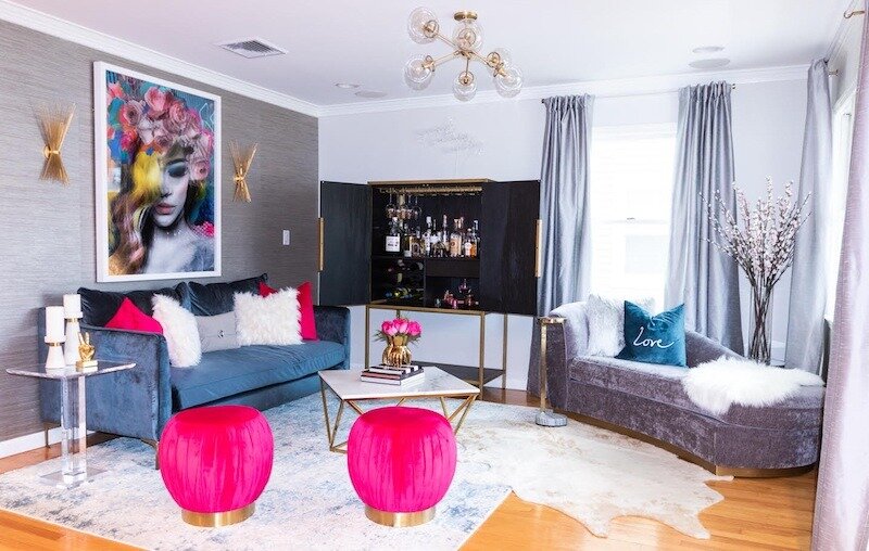
For the first concept board, the same artwork was used from the inspiration room.
The client already has a blue velvet sofa and chair from Bernhart that is staying in the room.
Naturally, the artwork and room design need to coordinate with those pieces.
The space is on the second floor of a California eclectic vibe condo at the Jersey shore.
Concept Board #1
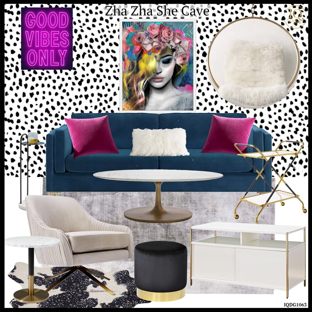
One of the reference pictures my client shared was of the super cool black and white spot wallpaper.
Of course, I LOVE this look because it is fashion trendy and happy.
You know me and my whole Rainbow/ Unicorn vibe by now so this is right up my ally.
As I was creating the room I was thinking I wonder if she is really this bold because not for anything but as much as I love this room it is definitely a commitment.
Anytime a room is super bold and creative there is more of a chance you will get tired of it and it can look dated after a while.
Now if this was for a millennial on the other hand who is bold and in the move every year or so phase I would say yes go for it!
When I was in my twenties we literally moved every year.
I think the longest we stayed in one place was two years max.
For a forever home, on the other hand, I would think twice unless you have it like that and can redo the room when you get tired of it.
While most of the pieces are neutral other than the fuschia pop and the black and white accent wall, changing out the wallpaper would not be a quick process.
By the way, if you are wondering where that cute acrylic hanging chair is from you can find it HERE.
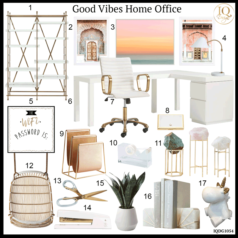
Concept #1 Product Details:
Concept Board #2
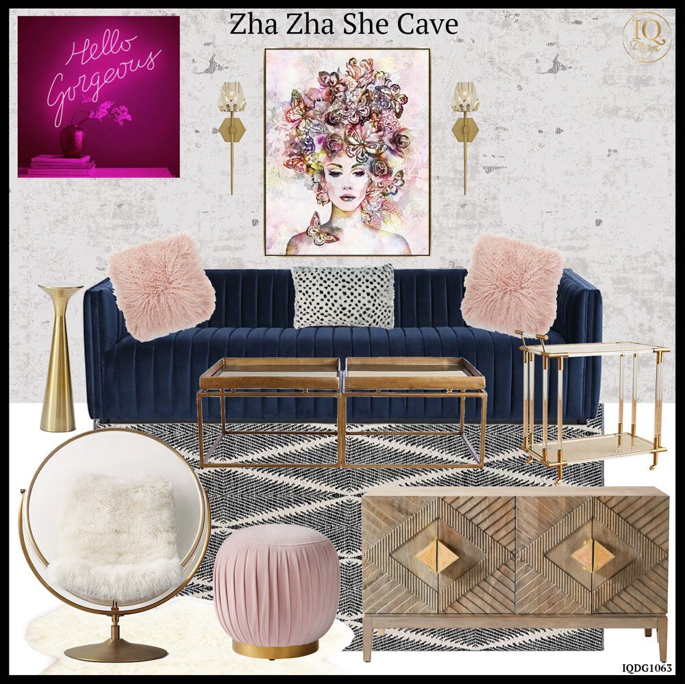
For the second concept, the art chosen has a softer feel but is still colorful.
For this space, blush pink with black and white was used as the accent color.
The wallpaper is more subdued but the rug is bolder in this design.
Since this wallpaper is more neutral it would have a longer lifespan than the bold spot paper.
In this design, a floor acrylic chair is shown instead of the hanging chair.
Obsessed with these chairs (yes I know I have a lot of obsessions).
I also have a thing for neon signs as you may remember from the One Room Challenge I participated in.
The original Good Vibes Only and Hello Gorgeous neon art can be found at AOOS.
Concept #2 Product Details:
As you can see both of these rooms have a different color story and feel based off the artwork as the starting point.
In the end, this space was a bit too bold as I thought and the room took a similar but toned down dramatic direction.
Be sure to come back for a future post on the final design and the process it took to get there.
Let me know in the Blog comments which concept is your favorite from the two shown above!
I hope you are all staying healthy and well.
Have an inspired night full of Unicorns and Rainbows!
xo Nicole
For more shoppable designs check these out from my Like To Know It page.
Note: My blog periodically contains affiliate links meaning that if you make a purchase, I might make a small commission at no extra charge to you. Purchases made through them are greatly appreciated.

Concept board #1 is my fave!
Yes! I love that one too! Thank you for the comment btw ; )